Kickstarter Pre-Launch Page Examples

The most useful Kickstarter pre-launch page examples make the product easy to understand, show relevant proof, and give visitors a clear next action. Study how each page handles those tasks, then test the same principle with your own audience. A successful campaign’s funding total does not prove that its page design caused the result.
This guide examines documented examples and explains what creators can adapt. It separates external email-capture pages from native Kickstarter pre-launch pages and reusable templates, so you can compare like with like. Examples were researched on September 14, 2026; historical page designs and offers may have changed.
Compare pages with the same purpose
An external landing page usually collects email leads. A native Kickstarter pre-launch page invites people to follow the project. A live campaign page asks people to pledge. A screenshot of a preorder page may belong to a later stage or even another crowdfunding platform.
Before borrowing an idea, record the page’s stage, audience, incentive, and requested action. A returning game creator can rely on character recognition that an unfamiliar hardware brand has not earned. A page with an established fanbase may need less explanation than a product that introduces a new behavior.
Treat the following examples as design references, not as a ranking of measured conversion performance. The practical recommendations are editorial interpretations of the documented features; comparable traffic and conversion data are not available across these pages.
Seven examples and the decisions behind them
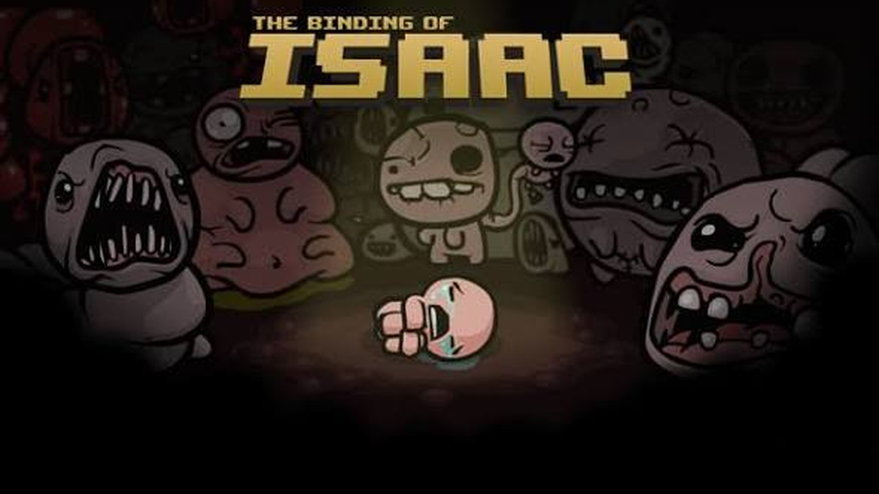
The Binding of Isaac uses recognition to orient the visitor
In ConvertFlow’s collection, the documented Binding of Isaac page identifies the game and explains a signup benefit. The starting advantage is a recognizable product world.
For a creator with an existing audience, that suggests a useful test: can the first screen connect the new project with something supporters already understand? Put the new offer in context quickly. For a first-time creator, replace assumed recognition with a plain explanation. A logo cannot perform the work of a value proposition for visitors who have never seen it.
Do not imitate the visual language of an established property simply because it looks distinctive. Borrow the decision to orient the reader, then use your own identity and evidence. Ask a new visitor what they think the page is offering before adding more decorative elements.
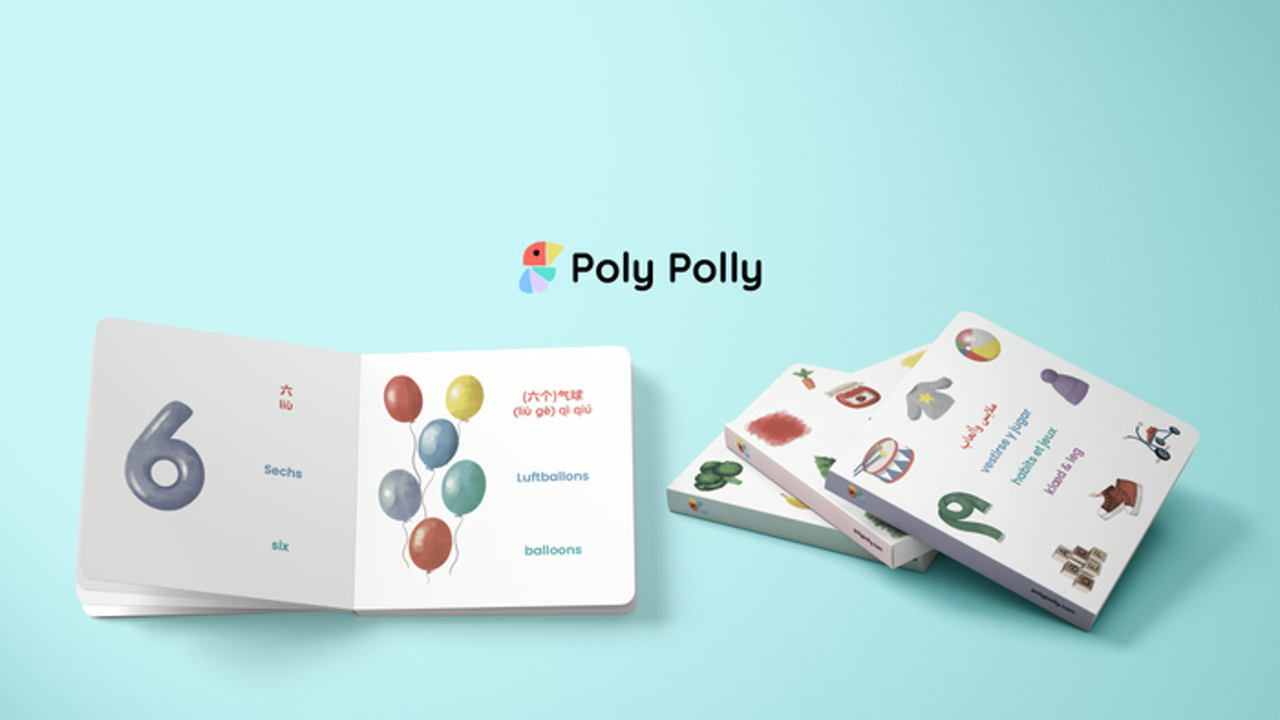
Poly Polly gives readers another chance to subscribe
The same example collection describes signup opportunities at different points on Poly Polly’s page. Repeating an action can help readers who need more context before deciding.
The practical lesson is to distinguish repeated buttons from competing goals. A second email-signup button can support the same journey. A row of unrelated actions can make the choice less clear. For your own page, identify the point where someone has seen enough product evidence, then provide the next step there.
Avoid adding buttons after every short paragraph. Read the page as a sequence of questions: what is this, why would I want it, can I trust it, and what happens next? Place the form or return-to-form action where that sequence reaches a natural decision.
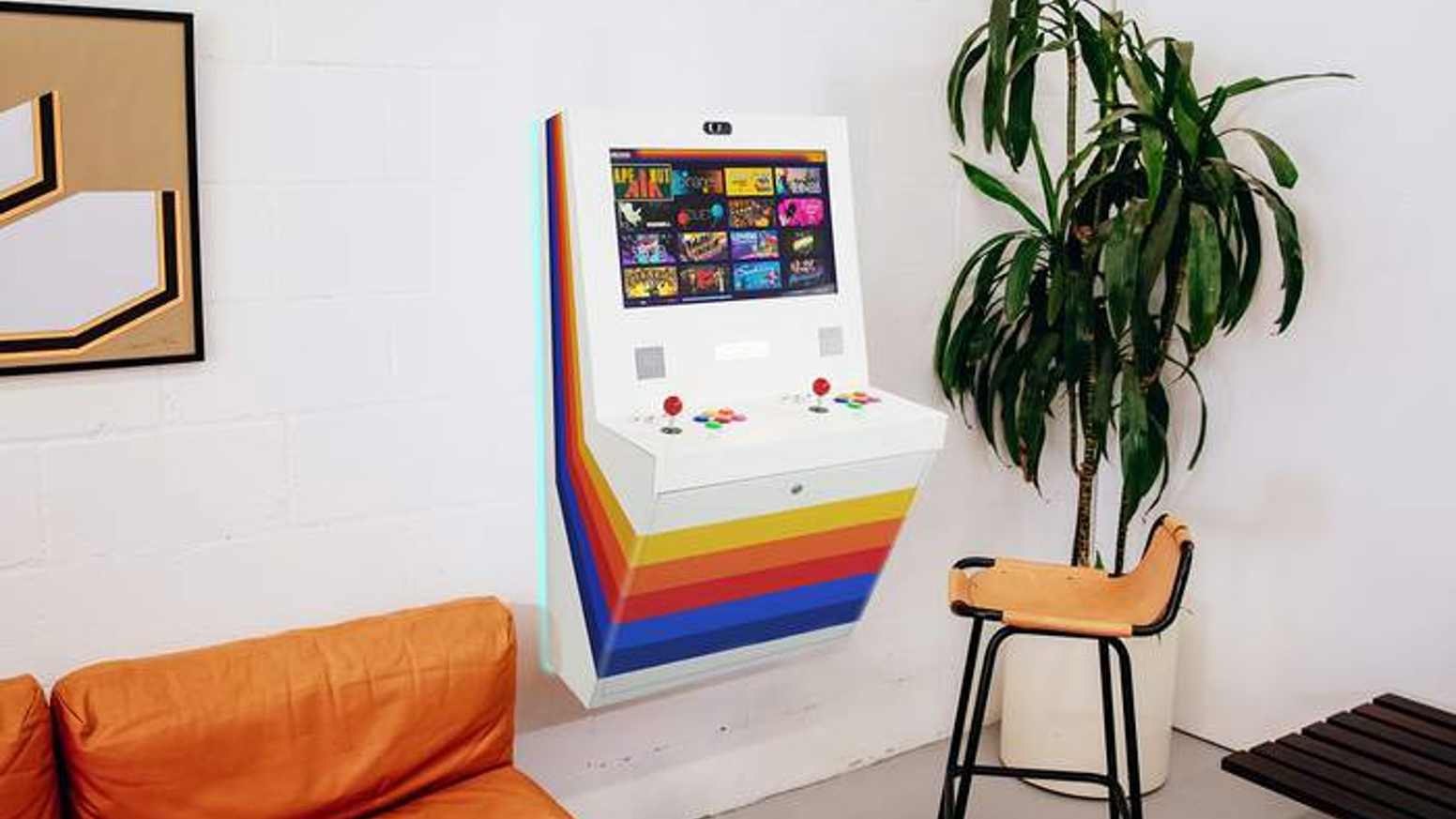
Polycade Sente shows how restraint can support product identity
LaunchBoom’s examples guide describes Polycade Sente’s minimalist approach as consistent with the product’s appearance. That is a useful example of the page supporting the object rather than competing with it.
An adaptation is to remove elements that do not clarify the offer or support trust. Start with the hero area. If the product, headline, and signup are all competing with a large menu, multiple badges, and animated decoration, remove the least useful item and reassess.
Minimalism is not a requirement to withhold important information. A sophisticated product may need dimensions, compatibility details, and demonstrations. Keep those facts accessible and organize them clearly. The test is whether the page becomes easier to understand, not whether it contains the fewest words.
SeatMate aligns proof with a likely buyer concern
LaunchBoom’s SeatMate discussion highlights a veterinarian-approval section. The relevant pattern is choosing proof that speaks to the category rather than adding generic praise.
For a pet product, the buyer may worry about suitability and comfort. A game buyer may want an independent playthrough. A hardware buyer may need a demonstration of the exact function being promised. Identify the concern before choosing the proof element.
Any expert statement you use should accurately reflect what that person evaluated and approved. Do not turn a narrow comment into a broad endorsement. If independent feedback is not available, show your own testing process and explain its limits. Specific evidence is more useful than an unsupported “trusted by experts” badge.

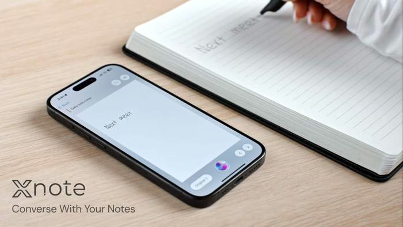
XNote translates a technical product into recognizable tasks
The archived XNote page organizes its pitch around actions such as transferring handwriting, searching notes, and handling tasks. It also repeats signup prompts. Those are observable messaging choices, not independently verified product-performance claims.
The adaptation is to explain a technical feature through the job the user wants to complete. Instead of naming an underlying technology and leaving the visitor to interpret it, show the input, action, and resulting output. Use the same structure in your page sections and demonstration footage.
Keep any savings or performance claim separate from the demonstration until you have evidence. A video showing one successful workflow is helpful, but it does not establish reliability across every device or use case. For an unfamiliar product, clear limits can make the story more credible.
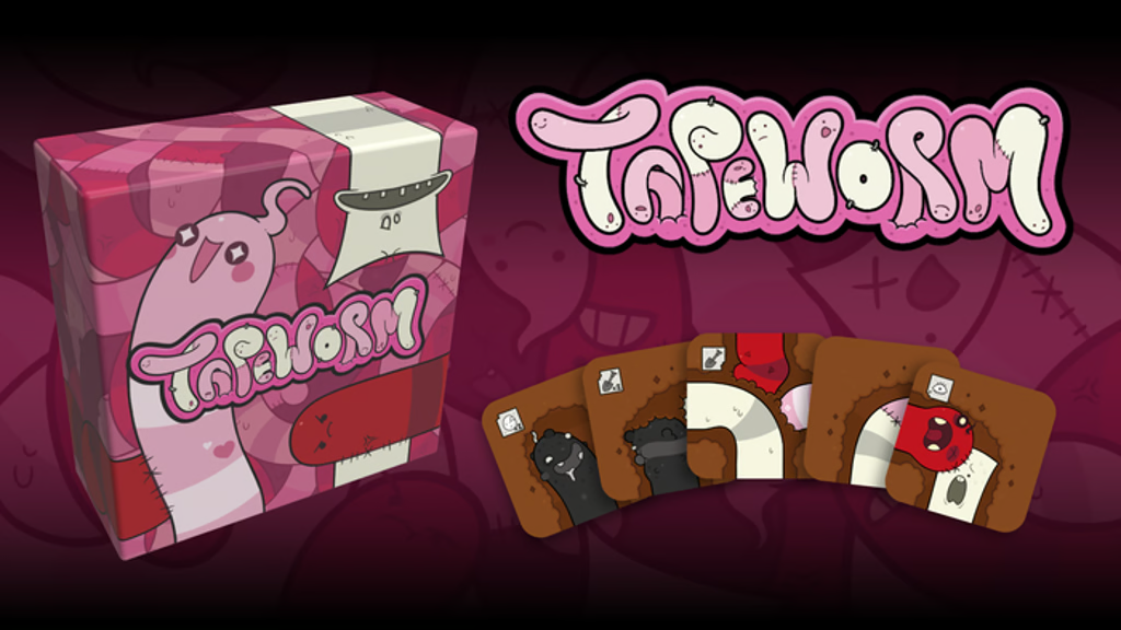
Tapeworm connects the incentive to the product audience
BackerKit’s landing-page chapter discusses Tapeworm’s incentive linked to later backing. This makes the reward relevant to people interested in the game rather than to anyone looking for a generic prize.
For your own campaign, ask whether the incentive attracts people who might want the main reward. A complementary item, early notice, or clearly defined launch benefit can align with that goal. A broad giveaway may inflate the list while making later conversion less predictable.
Explain the conditions in plain language. Does a person need to subscribe, pledge during a window, select a reward, or complete another action? Put those terms where people see the offer. An incentive creates a communication obligation as well as a marketing opportunity.
KickoffLabs offers a starting structure rather than a finished strategy
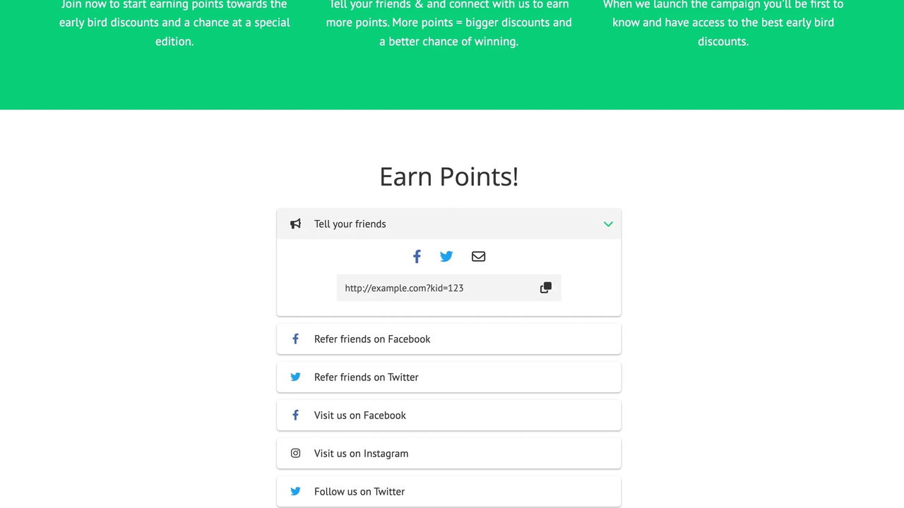
The KickoffLabs Kickstarter template is an editable external-page option for growing a mailing list. Its customization and engagement features are tools to configure around a campaign goal.
A template can help you get a first version online, but default sections and incentives should not make the strategy for you. Replace sample copy with accurate product information, remove irrelevant elements, and test the contact flow before sending traffic.
If you add referral or contest mechanics, measure whether the resulting leads fit your project. More sharing is useful only when it introduces relevant people and sets expectations you can meet. Start with a working signup process before layering on additional actions.
What the native Kickstarter page changes
The native page operates within Kickstarter’s presentation and follow system. Use its current editor and setup guidance as the source of truth rather than expecting an external-page screenshot to be reproducible there.
For a native example, Kickstarter’s pre-launch anatomy article includes projects such as Mini Tabletop Bowling and Melt Mouse while discussing clear descriptions and useful imagery. Study the way the product is introduced within the platform’s constraints. Do not confuse the platform follow action with joining your own email list.
Make your core pitch understandable even when someone sees only a brief project preview. A memorable image should still communicate the product. A clever title should still identify the project. Additional story content can deepen interest, but the basic presentation needs to work without it.
Build your own evaluation sheet before choosing a design
Use a simple review method with people who resemble your intended backers. Present the page without explaining it first. Record their answers rather than defending the copy while they read.
Ask these questions in order:
- What is being created, and who would use it?
- What would make someone choose it over their current alternative?
- What evidence makes the promise believable?
- What does the main button do?
- What happens after someone subscribes or follows?
- What unanswered question would stop you taking that action?
If answers differ sharply from your intended message, fix the explanation before adding more traffic. If people understand the offer but reject it, the issue may be product fit or price rather than design. Keep those diagnoses separate.
For a numeric scoring aid, you can rate clarity, proof, action, and mobile usability from one to three, using your own definitions. Treat that as an internal prioritization tool, not a validated predictor of funding. Written comments usually explain the problem better than a total score.
Turn inspiration into a testable page
Choose one pattern that addresses a real weakness. If visitors do not understand scale, add a contextual product photo. If they understand the offer but doubt feasibility, show a credible demonstration. If they want to subscribe but cannot find the form, improve the action placement.
Write a hypothesis before editing: “Showing the folded product will help travelers understand portability,” for example. Decide how you will assess it through interviews, form completion, or relevant engagement. Keep the traffic source and offer stable enough to interpret the comparison.
Review the page on a phone before calling the change complete. Check image crops, line breaks, button spacing, and the form keyboard. A desktop screenshot can hide the part of the experience most visitors encounter. Test both an error and a successful signup.
ScaleUp Lab’s crowdfunding services connect page creation with creative, traffic, and follow-up. That connection matters because a page cannot be judged independently of the people arriving on it and the messages they receive next.
Avoid the mistakes that example galleries cannot reveal
Do not copy a page’s incentive without checking the economics. A discount that fits one product can make another campaign difficult to fulfill. Do not assume a large brand’s short page will be sufficient for an unknown creator. Its audience may arrive with knowledge your visitors lack.
Be cautious with generic conversion benchmarks. Warm newsletter traffic, paid social visitors, and people arriving from a reviewer can behave differently. A signup rate does not tell you whether those people accept the price or will pledge later.
Keep the scope of your page honest. If it collects notifications, say that. If it offers a paid reservation, explain the terms. Avoid wording that makes an email signup appear to guarantee stock, delivery, or a funded campaign.
Personal landing page examples can offer inspiration for a creator biography, but often optimize for consulting inquiries or portfolio exploration. Borrow human details where they help establish trust. Keep the product and prospective backer’s decision central to a crowdfunding page.
Time the page around useful audience building
Publish an external page when you can accurately explain the project and support the follow-up it promises. Give yourself enough time to test the message and learn from responses. A “launching soon” headline is not a substitute for an audience plan.
For the native page, Kickstarter’s page-building guide recommends sharing at least a week before launch. Many projects will need a longer period of preparation and promotion. Revisit the plan if development changes the offer or timing materially.
Keep subscribers informed with useful progress rather than a repeated countdown. Before launch, make sure they understand the main reward, expected timing, and how to participate. Use recent engagement to judge readiness, not only the lifetime signup total.
Frequently Asked Questions
Choose the example that solves your actual problem
Use these references to make a specific improvement: clearer context, stronger proof, a better-explained incentive, or a more usable signup flow. That is more productive than collecting screenshots without deciding what each one should teach you.
Explore ScaleUp Lab’s campaign portfolio and 2026 Kickstarter roundup for further context. When you are ready to turn inspiration into a campaign asset, talk to ScaleUp Lab with your product stage, page link, and current audience results.